
Sometimes a keyboard makeover needs fewer new keys, not more. NuPhy’s Node Control T3 accents are a useful example: the letters stay calm, while a few controls give the board a much more deliberate retro character.
That is what makes this small launch interesting for a desk setup. You do not need to recreate an old computer or cover every key with nostalgia. A neutral base and a few well-placed accents can do most of the work.
What NuPhy is offering
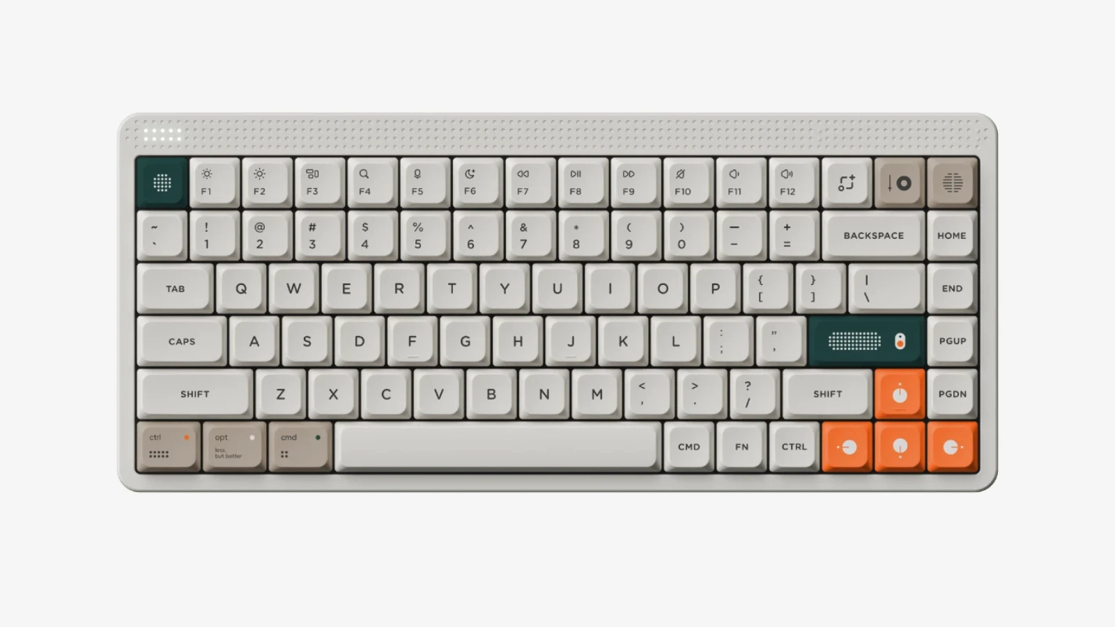
NuPhy announced its low-profile Node promotion on September 4, 2026. When checked on September 10, the official product page advertised an included Node Control T3 11-key set. It is an accent set, not a replacement for every key.
The announcement was also covered by Greenkeys on September 5. We are discussing the design, not claiming sales success or reporting a hands-on test. The promotion can change, so its current conditions belong on NuPhy’s page.
Want the keyboard behind this look?
NuPhy Node keyboards are now available at Novelty Keycaps. Our listing offers Nano low-profile and Max high-profile configurations in 75% and 100% layouts. Start with a Nano Low-Profile option if you prefer the lower keyboard height discussed here; choose 100% if you need a number pad.
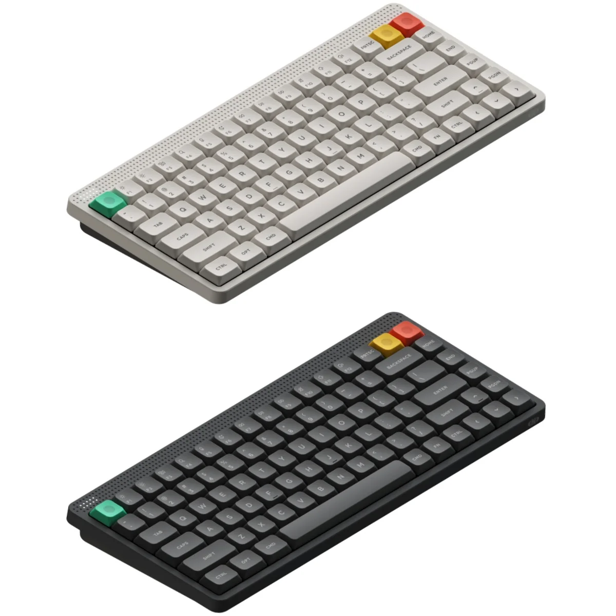
Keyboard versus T3: this listing is for a complete keyboard, not a separate Node Control T3 11-key set. Inclusion of the T3 accent kit shown earlier has not been confirmed and is not promised with the keyboard.
The clever part is where the color goes
In the installation image, orange draws attention to the arrows, dark green anchors Escape and Enter, and taupe gives a few controls a softer contrast. Most letter keys remain neutral. That distribution makes the keyboard feel organized instead of randomly decorated.
Our reading is that the accents work because they follow recognizable groups. The arrows form one small island. Escape sits on its own. Enter is already a visually important key. You notice a handful of decisions, not dozens of unrelated ones.
The icon-like details also matter. They make the caps feel closer to controls on a piece of equipment than to miniature posters. If your desk already has speakers, a camera, or audio gear, that is a useful direction to explore: repeat a design language rather than buying accessories that all have to carry the same logo.
A good base does most of the work
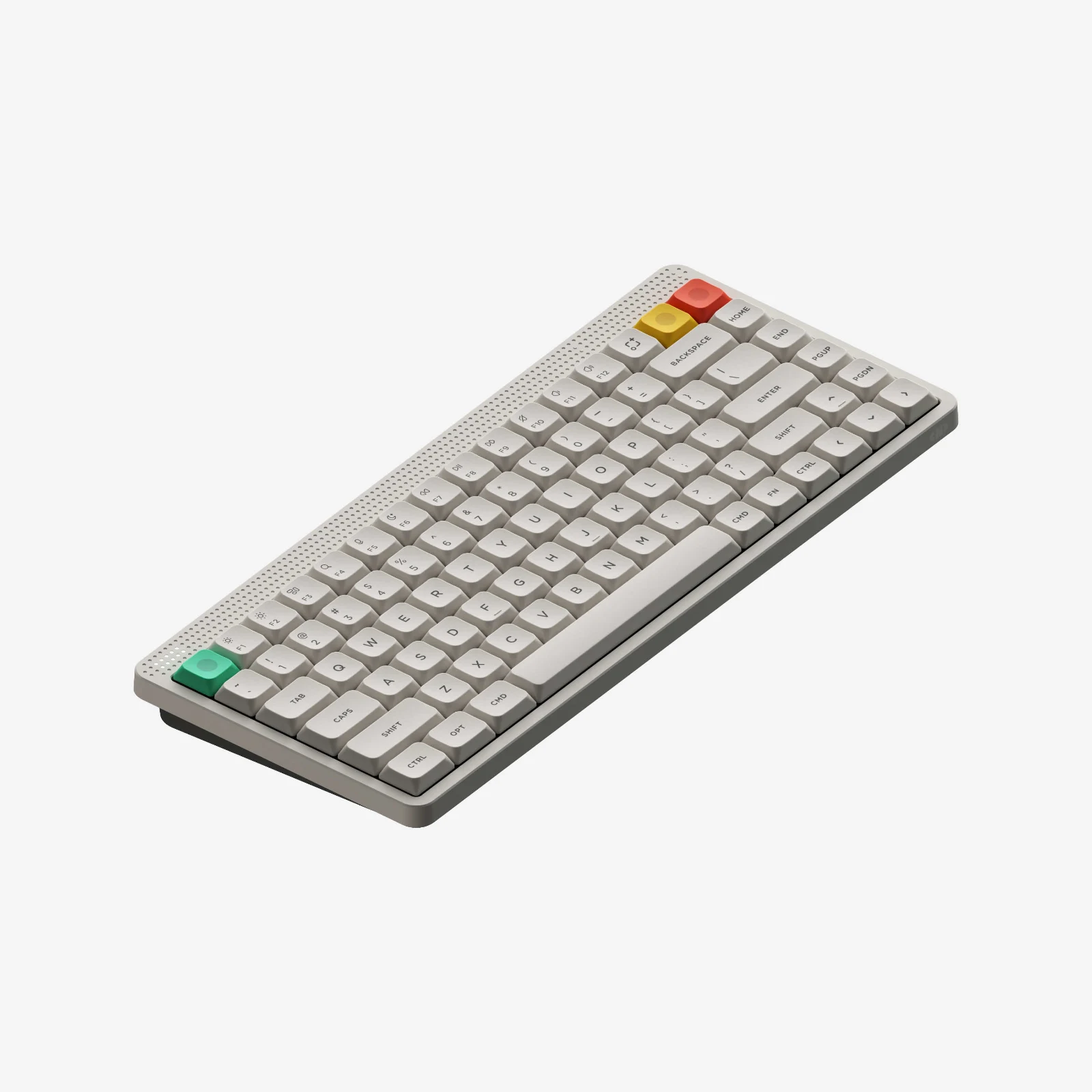
The standard board is already restrained. The T3 installation changes the emphasis, not the entire concept. This is the bit worth borrowing for your own desk.
Before buying anything, identify the largest areas of color you already have: desk surface, desk mat, keyboard case, and letter keys. Those form the backdrop. If they are all fighting each other, a few novelty keys will not magically pull the setup together.
On a pale desk with a light keyboard, a small dark accent can give the board some definition. On a dark desk, a light set can become the focal point. A warm wood surface can support a softer, less clinical look. These are starting points, not rules about which colors are allowed together.
Then choose one accent to echo elsewhere. An orange key might connect to a small detail on a desk mat; a dark green key might sit comfortably beside a plant. You do not need orange everything. One quiet repetition is often enough.
When changing a few keys is enough—and when it is not
A partial change makes sense when you already like the letter keys. Keep the daily typing area familiar and give one edge or control group a little more character. It is also easy to evaluate: photograph the desk, make the change, and compare the same view.
A full set makes more sense when the existing colors, legends, or key shape are the part you dislike. An orange Escape key will not turn a vivid pink letter field into a restrained industrial design. In that situation, build the base first and decide on accents afterward.
There is also a difference between nostalgic and minimal. You may want a clean piece of old-style equipment, or you may want the playful details of an arcade. Both are retro. They just create very different desks.
Two other ways to bring retro character to a board
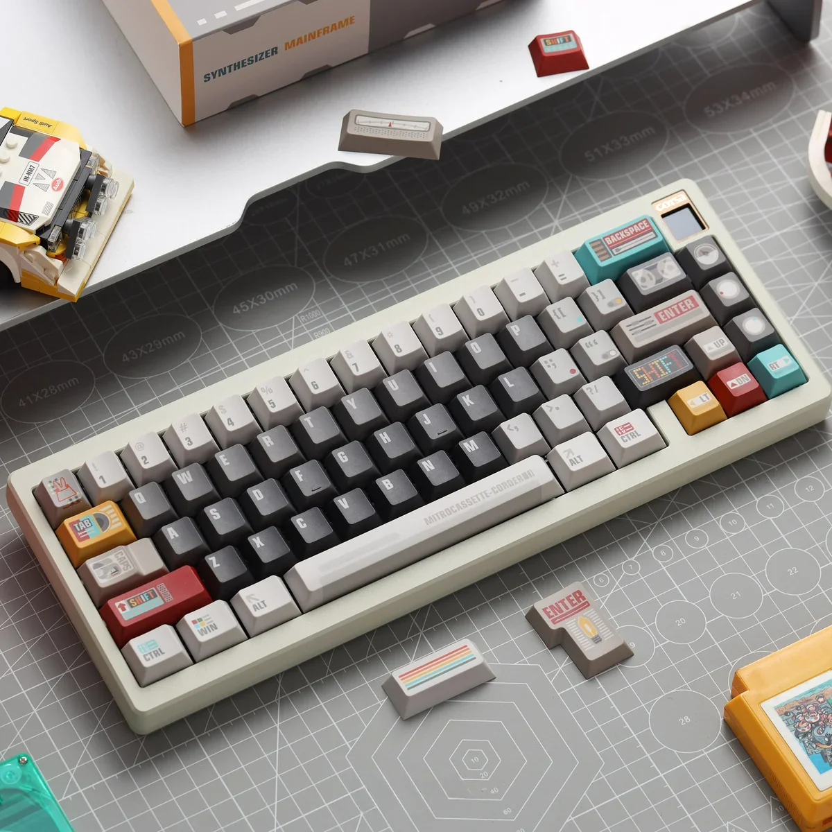
The Retro Synthesizer set takes a more detailed route. Its neutral letters leave space for colorful, equipment-inspired modifiers. Compared with the T3 idea, this is a fuller visual story: more labels, more graphics, and more to discover up close.
We would pair that kind of set with a simpler mat and avoid adding several unrelated novelty themes around it. If the keyboard is already telling a story, the rest of the desk can give it room. The listing specifies PBT and Cherry profile; it is not the NuPhy low-profile accent kit.
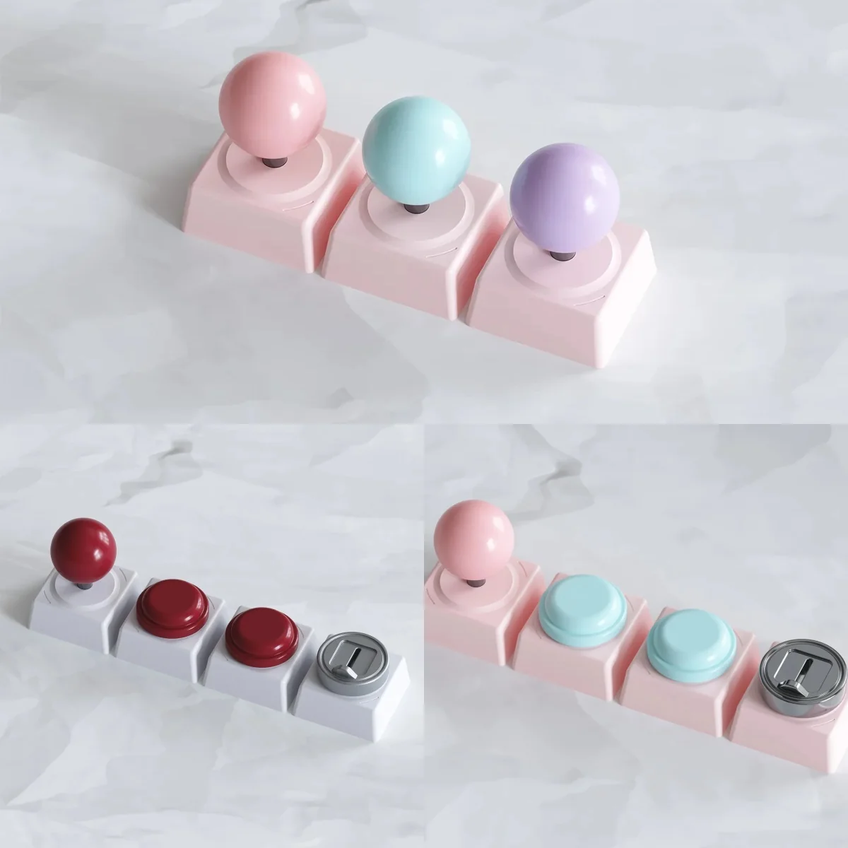
The Arcade Joystick and Button accents go in the other direction: a small sculpted object rather than a coordinated flat color scheme. That can be the right choice if you want one playful reminder of an arcade, not a full keyboard transformation.
A raised joystick shape also illustrates why appearance and use need to be considered together. We would keep a sculpted accent away from busy typing positions and check its height and clearance. Do not assume a decorative joystick-shaped keycap functions as an actual joystick.
Borrow the palette, not an assumption about fit
The design lesson transfers between keyboards; the physical keys may not. NuPhy’s promotion is for its low-profile Node models. Our two examples are separate products, not verified Node upgrades.
Before mixing caps, compare the exact switch mount, profile, row, width, and stabilizer positions. An MX-style stem alone is not a guarantee of low-profile compatibility. Also check the selected package contents: a photo of several colorways does not necessarily mean all of them are included.
For a normal-height board, our Mac, Windows, and custom-keyboard fit guide walks through the practical checks. If you only want inspiration, you can use the color idea without buying any of the products shown here.
The takeaway: make a few choices visible
The nicest thing about the T3 approach is its restraint. It gives selected keys a role and lets the rest of the board stay quiet.
Start with what you already like about your setup. Choose whether you want calm industrial retro, graphic audio-equipment nostalgia, or one playful arcade object. Then make the smallest change that gets you there. A desk feels personal when its choices belong together—not simply because every surface has been customized.
If you also want a keyboard base for this kind of desk setup, compare our NuPhy Node keyboard configurations. These are complete keyboards; the T3 accent kit is not promised with this listing.